
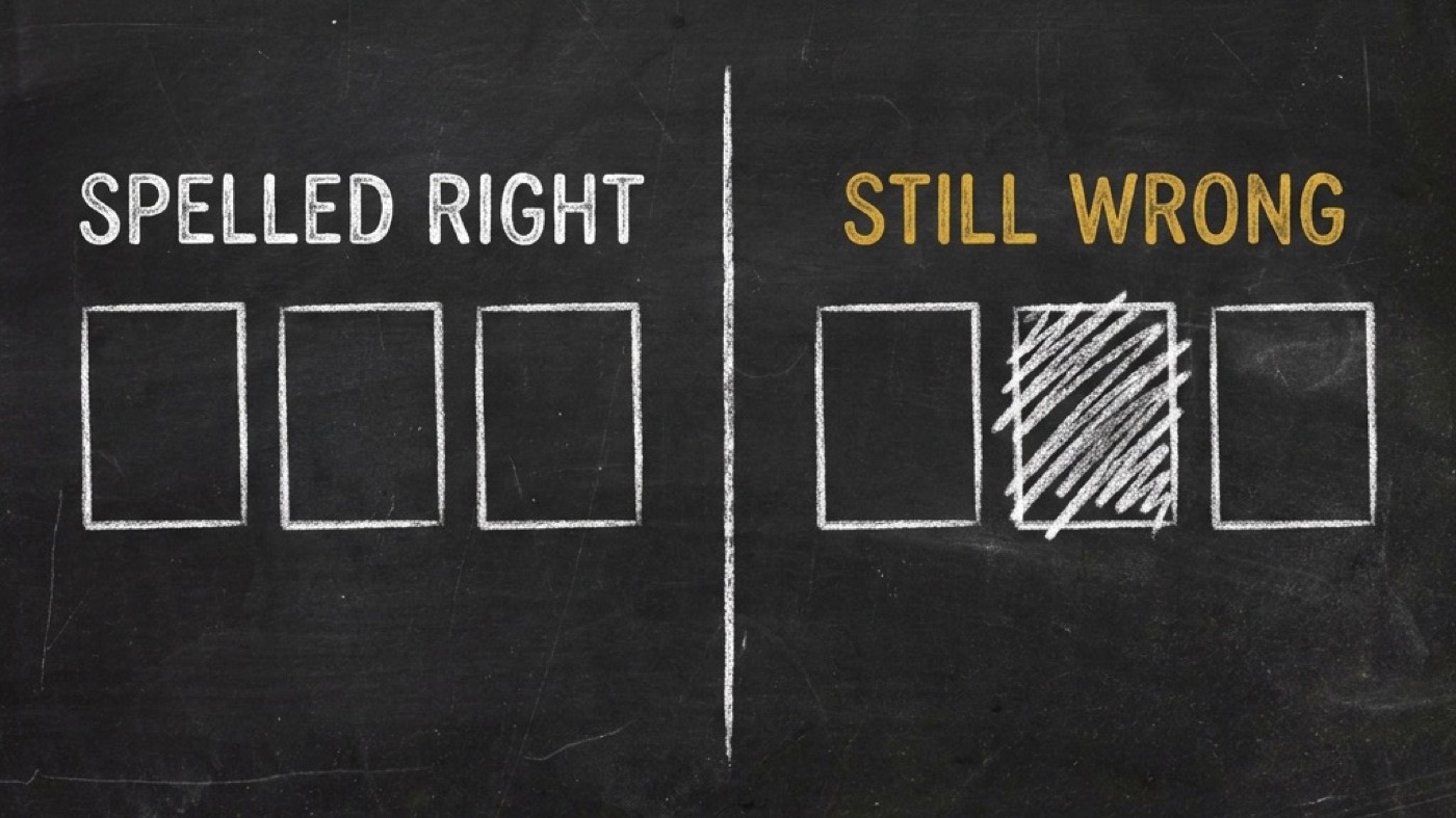
Perfect spelling at 20 labels. Missing facts at 8.
I asked an image model to draw an infographic with eight labels. It drew nine. One of my facts was gone, two were duplicated, and the word STEM was sitting underneath a water droplet.
Every single letter was spelled correctly.
That render is why I shipped @di-atomic/infographic today, and why its routing rule does not match what the rest of the category does.
The rule everybody inherited
I studied four public infographic and design skills before building this one. They disagree about plenty. They agree on one thing, and they all phrase it almost identically: image models garble dense text, so render from code.
I inherited that rule. Then I measured it.
Eight renders. One variable: how many labels I asked for. Same subject, same style, same 1:1 canvas, same model (openai/gpt-image-1 through SpiderGate), same quality tier. Labels drawn in order from a fixed pool of 24 short, common English words. I read every render myself and transcribed every string it drew. Total cost: $0.336.
Labels asked for | Spelling errors | What went wrong with the set |
|---|---|---|
4 | 0 | nothing, clean |
6 | 0 | nothing, clean |
8 | 0 | drew 9 · |
8 (repeat) | 0 | drew 7 · |
12 | 0 | 3 labels drawn off the bottom edge of the canvas |
16 | 0 |
|
20 | 0 |
|
24 | 2 ( | 4 dropped · order scrambled · 4 cropped |
Here is why that matters. Spelling was perfect at 4, 6, 8, 12, 16 and 20 labels. The first misspelled word showed up at 24. The reason this whole category avoids image models turns out to be about three times more forgiving than the category assumes.
The failure everyone is missing
But there is a catch, and it is worse than the thing everybody is guarding against.
What broke at eight labels was not spelling. It was the set. WATER dropped. LEAF and FLOWER duplicated. STEM bound to the wrong icon. I ran the same count again and got a different failure: SPROUT gone, two icons drawn with no label at all.
Then containment. From twelve labels up, the model laid out a grid wider than the canvas and drew labels off the edge entirely. Three facts lost at 12. Four at 20. That is not a text-rendering problem at all. It is composition, and it is invisible to any check that reads your prompt instead of the picture.
Then a ceiling. 16, 20 and 24 all rendered exactly sixteen labels. Asking for twenty-four does not get you a denser graphic. It gets you a sixteen-label graphic that is quietly missing eight of your facts.
Now for the part that should change how you check these things:
A checker that looks for unreadable text passes every single one of those failures. The artifact looks clean. The typography is fine. The words are spelled right. It is just missing one of your facts, and nothing in the pipeline tells you.
So the router splits on a measured line
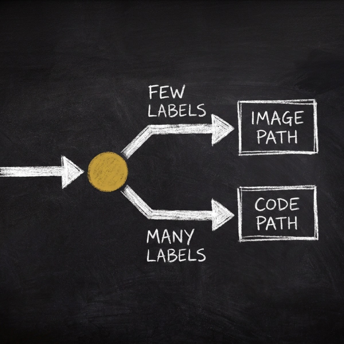
Illustrative style and six labels or fewer goes to the image path. That is where I measured clean. Seven to sixteen warns you that labels may be dropped, duplicated or mis-bound, and offers you the HTML path instead. Above sixteen it refuses the image path outright and tells you why.
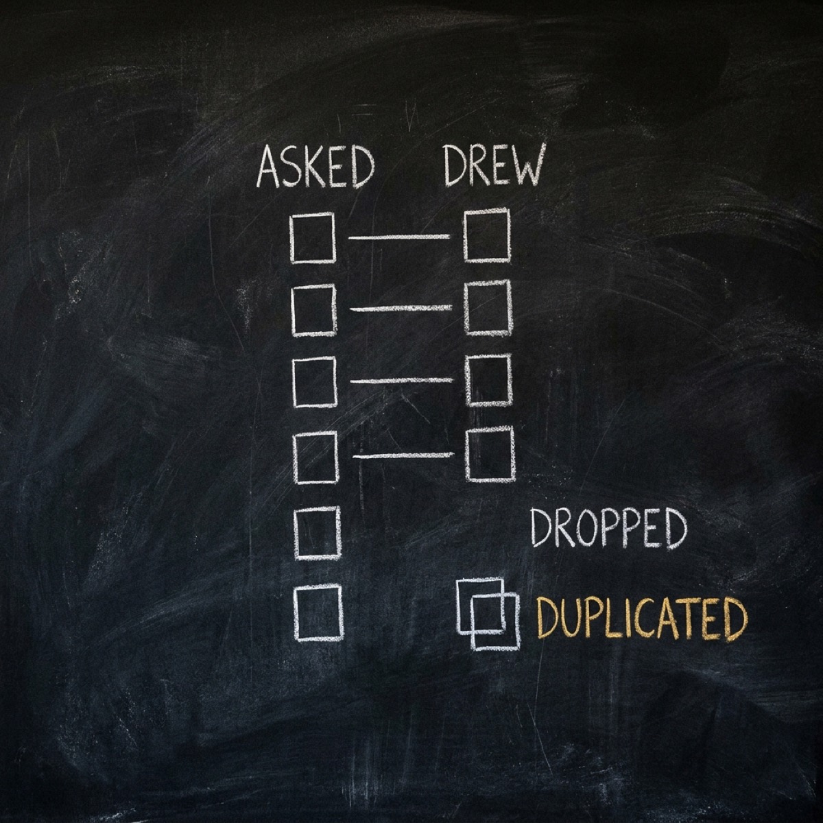
And on that path the check is an exact set comparison against the rendered picture. Not a legibility judgement. Requested set in, rendered set out, and the report names what happened to each one: dropped, added, duplicated, mis-bound, bare icon, cropped. Six labels can sit inside the ceiling and still come back with a broken set. The ceiling alone does not protect your facts. The comparison does.
The other rule that did not survive
Let me show you the second one this changed.
The prior art also carries a copy rule: keep every block of text under fourteen words. I was going to inherit that too.
Then I measured twenty-five published information graphics, from Minard and Nightingale through Our World in Data, the CDC and national health agencies. The Public Health Agency of Canada's COVID preparedness poster runs bullets of twenty-five to forty-five words across three levels of nesting. It is real, nationally distributed, and one of the best things in the whole corpus.
A global fourteen-word rule rejects it.
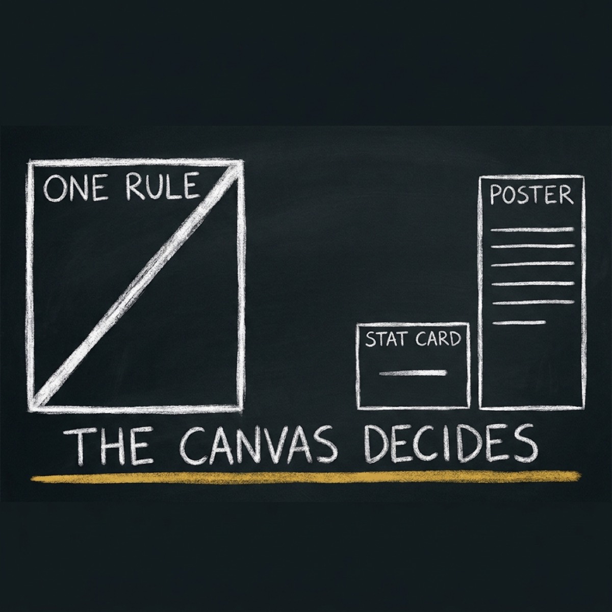
So the cap moved. It belongs to the canvas you picked and the kind of block you are writing: fourteen words on a stat card, forty-five in a reference poster. The script that checks copy density holds no cap table at all. It reads the numbers off the canvas, and when it cannot work out which canvas you are on it reports "copy density NOT verified" instead of falling back to a default. A default would quietly reinstall the exact rule the corpus just falsified.
What I am not claiming
Bottom line, here is the part most launch posts leave out.
One model. English only, short uppercase words, no digits. One aspect ratio. One sample per point, two at the failure point. That is a floor, not a curve. Numerals are the known-worst case for rendered text and I left them out on purpose to isolate the set-integrity effect. A model with better layout control could plausibly push containment further.
So treat six as per-backend and re-measurable, not universal. The measuring script ships with the skill, so you can re-run it against your own backend when the models move. They will.
The rest of what shipped: fifty-nine composable pieces (canvases, sections, styles, elements), each carrying an evidence tag saying whether its number was measured, cited, derived or thin. Fourteen references. Thirteen learnings. Five scripts that print numbers and exit zero, because the report is the product, not the exit code.
You still decide whether to ship the graphic. You just do not get to decide unknowingly.
A style you cannot select is not a style
Twelve days after I shipped this, a live client run asked for the hand-drawn look. It could not select it.
I had shipped that look as style/hand-drawn-marker, and I had declared it raster-only. My router caps the raster path at six labels and refuses above sixteen. Those are the numbers from the eight renders above. I still think they are right. But together they meant my sketch register was unselectable for any real information graphic, because real ones run past six labels.
So the session did the reasonable thing. It hand-built the look in CSS.
Then my gate went quiet.
Check C in verify-density-caps resolves your style by name against the registry. There was no item to resolve, so it returned UNCHECKED. The summary line still printed RESULT: PASS.
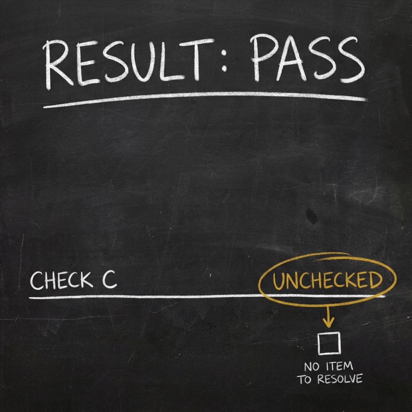
Read that twice. A hand-built style switches off my own measurement, and the headline still tells you it passed. That is worse than a failing check. A failing check gets fixed.
What I changed in 0.2.0
style/hand-drawn-html now ships. Same look, HTML path, token-based, no label ceiling. Against that same spec, check C returns PASS · html ∈ [html] with zero unchecked, and it FAILs if you pick the style on the raster path. I left hand-drawn-marker alone. It keeps its six-label cap, and it now names its counterpart, so your next session finds the pair instead of the dead end I left. The registry goes from fifty-nine pieces to sixty.
I harvested the look. I did not harvest the colours. Two of them did not survive my measurement. The reference gold #C9A227 measures 2.22:1 against its paper, under the 3:1 floor WCAG 1.4.11 sets for a graphical element, so I ship it at #A6841A and 3.25:1. The marker yellow #EEBF01 is 1.59:1 as text, so I restricted it to ground, where ink on it reads 10.02:1.
The rule that turned out to be a dial
I also ship an opt-in SVG displacement filter, adapted with attribution from cathrynlavery/diagram-design (MIT, commit da45d4a). I looked at that repo as a merge and said no. It budgets nine nodes. A normal artifact here runs eighty-eight text nodes. It carries no contrast mathematics at all. Complementary, not superior.
Its rule is filter shapes, never text. Stated as a binary.
On an HTML canvas your text is a child of the box you are filtering, not a sibling. So I swept it. Five points, 14px body, one render each.
Clean to scale 3. At 4 my baseline waves and 14px starts to drift. At 6 my glyphs skew and the digits fall off the line.
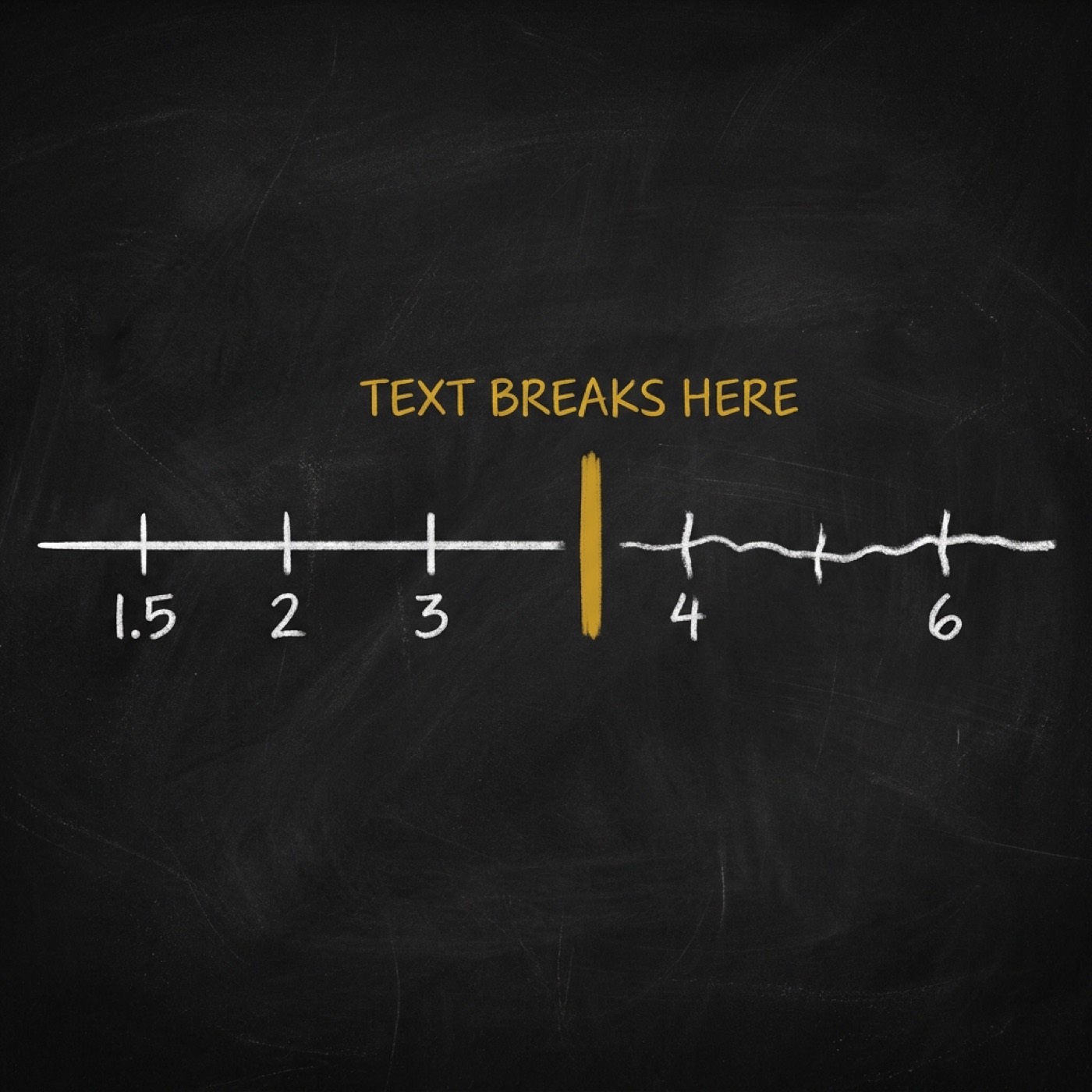
So it is a threshold, not a binary. And I think the naive build is safe only by accident. It holds while your wobble is subtle. It fails the moment you turn the character up for more of the look. A shell layer costs you three CSS rules and removes the ceiling: scale 6 border wobble, crisp type.
One honest limit. I tagged this item MEASURED (n=1). It is one gate-verified build, not the twenty-five-artifact corpus behind the rest of my registry.
@di-atomic/infographic v0.2.0 is live on the OPVS marketplace. Install it with opvs-skills install @di-atomic/infographic.