
Great blog illustrations aren't rendered — they're planned
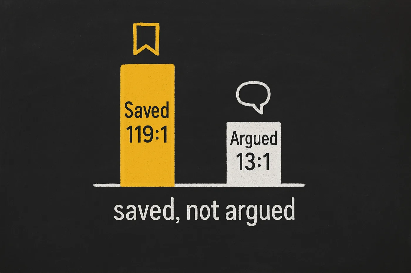
Here's a number that changed how I illustrate everything I publish. On the boards where people rate explainer graphics, the clear ones get saved about 119 times for every single comment. The clever, arguable ones run closer to 13 to 1. Same topic. Same effort. One got understood; the other started a fight.
That ratio is the most honest scorecard for an illustration I've found. A good explainer doesn't provoke debate — it ends it. People save it and move on.
The problem: I was paying to make my own writing skippable
For a long time my process was backwards. I'd write a solid article — argument tight, examples real — and then treat the images as an afterthought. I'd open an AI image tool, type "make a nice image about lead generation," and get back something beautiful and empty. A glowing funnel. An abstract mesh of dots and lines. Wallpaper.
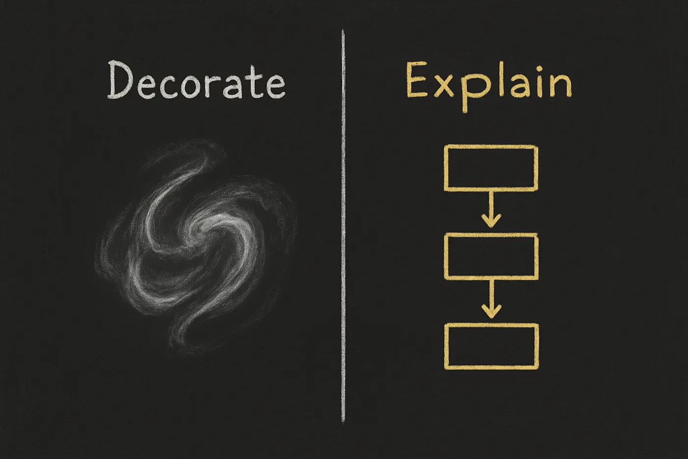
It decorated the page. It explained nothing.
The reader scrolls past wallpaper. Worse, a decorative image quietly signals that the section isn't worth slowing down for. So I was spending real money and real time to make my own writing easier to skip. That fails the only test I care about: does it make money, save money, or save time? A pretty image that teaches nothing does none of the three.
The fix wasn't a better prompt — it was a missing step
The thing I was skipping was a plan.
Before I render a single image now, I do what a good editor does. I read the finished article and ask one question of every section: what is the one idea a reader has to get here? That idea is the anchor. One anchor, one image — never five ideas crammed into a busy diagram nobody reads.
Then I lay the anchors out as a shot list. What each image explains. Where it sits in the article. Which composition carries it — a before/after, a flow, a contrast, a map. And one consistent visual style across the whole set. Only after that plan exists do I render anything.
That planning layer is a skill I shipped: @di-atomic/explainer-illustrations. It doesn't draw anything. It reads the article, pulls out the cognitive anchors, and builds the shot list — the editorial thinking a rushed prompt skips entirely. The actual drawing is handled by a second skill, media-generator, which routes every render through our own image stack so the full set stays locked to one style.
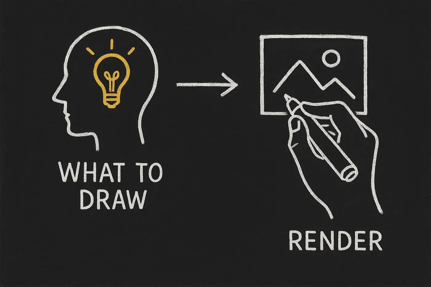
Planner and hands, kept separate on purpose. The planner is reusable — the same shot list can feed a blog, a carousel, or a slide deck. The hands are swappable. Most people reach straight for the hands and wonder why they get wallpaper. The intelligence was never in the image model. It's in deciding what to draw.
The example is this post
I ran this article through the skill before I published it.
It read the draft and came back with four anchors, not fourteen. Here's the shot list it produced:
The save-to-argue signal — one graphic contrasting an explainer that gets saved with one that gets argued (119:1 versus 13:1).
Decorate versus explain — a straight before/after: the empty glowing funnel on the left, a labeled flow that actually teaches on the right.
Planner and hands — the split between the skill that decides what to draw and the skill that renders it.
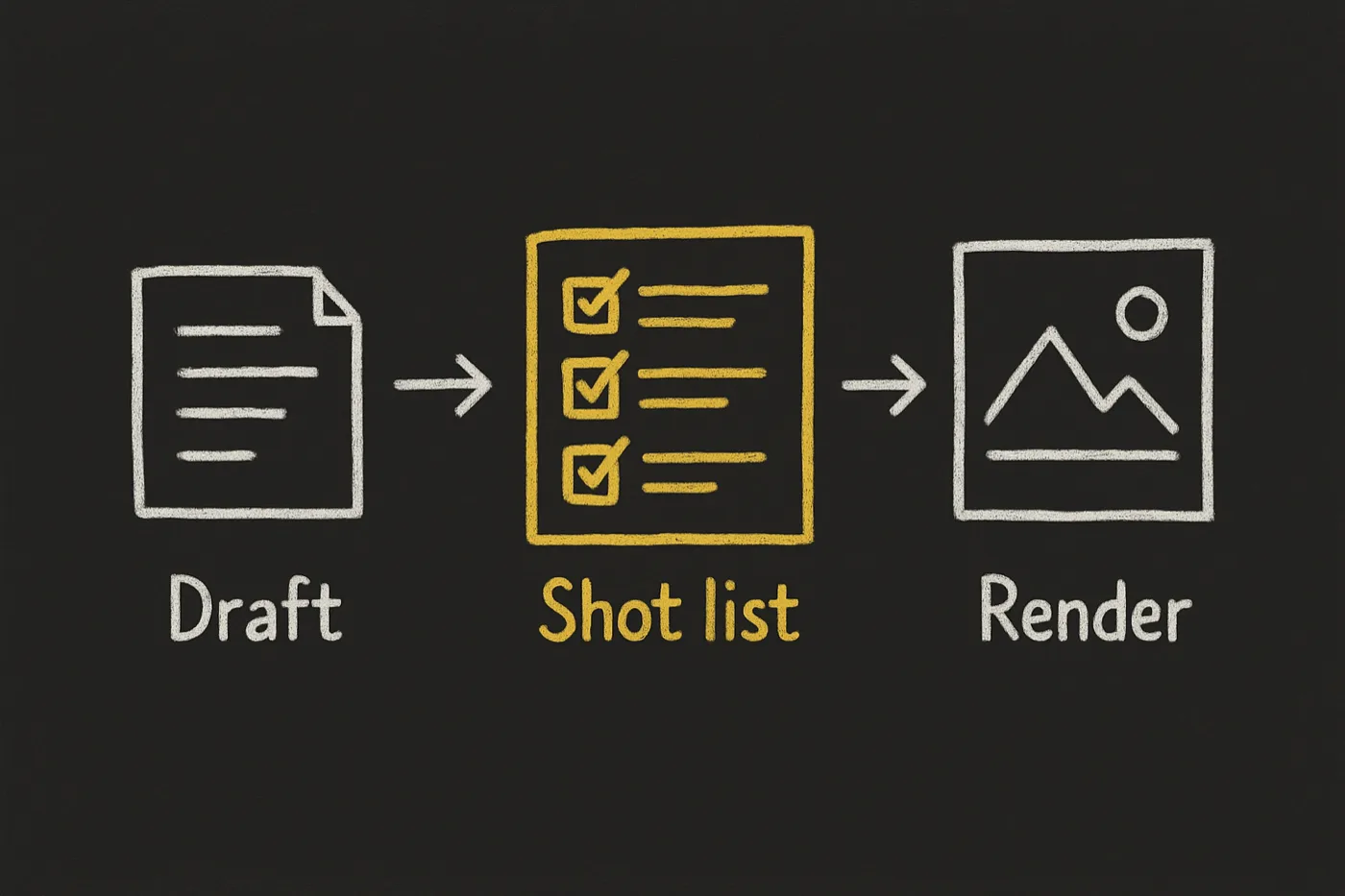
Plan first, render second — the shot-list step sitting between the finished copy and the image tool.
Every image in this post is in the same house style: a dark board, white chalk lines, one gold accent. Not only because it looks like us — because a consistent set reads as one argument instead of five stock photos that happened to land on the same page. The skill picked the anchors. I didn't brainstorm images on a deadline and hope. The discipline lives in the tool, not in my willpower at 11pm.
The numbers are not subtle
I don't have to inflate this. Studies put articles with images at roughly 94% more views than text-only ones. Illustrated instructions — the kind that actually teach a step — are reported at around 323% better comprehension. Carousels, where every slide is one clean anchor, are cited at up to 585% more engagement than a plain text post.
But the number I keep coming back to is that save-to-argue ratio, because it's the one you can feel. When an image explains, people quietly keep it. When it decorates, they scroll. When it's clever but unclear, they argue in the replies and share nothing. That's a number you can optimize. You can't optimize a vibe — but you can optimize "did they understand it in one second."
Try it
If you publish anything — blog posts, case studies, release notes, a pitch deck — the missing step is almost never a better image model. It's the plan you skipped.
The skill is live on the marketplace as @di-atomic/explainer-illustrations. Point it at a finished draft with "illustrate this article," and you'll get a shot list back before anything renders: what to draw, where it goes, and why each image earns its place. Then media-generator draws the set on one style.
Plan first. Render second. Ship images your readers save instead of scroll.